
In this article, we’ll embark on a journey through the fascinating world of logo design, exploring the fundamental principles, techniques, and considerations that every aspiring designer needs to know. Whether you’re a newcomer to the field or looking to enhance your skills, this guide will equip you with the knowledge and insights to create compelling and impactful logos. So, let’s dive in and uncover the artistry behind the effective logo design.
Contents
Types of Logos
With millions of logos worldwide, it may surprise you that they all fall into one of seven main categories. Each logo type possesses unique characteristics, strengths, and weaknesses. Therefore, it’s essential to choose the variety that best aligns with your brand values and goals when designing your logo.
1. Emblems
An emblem is a traditional type of logo that integrates text within a symbol or icon to create a unified image. Emblems convey an official, formal look, emitting an air of cohesion and strength. They are well-suited for brands like Harvard, aiming to communicate rich history and traditional values.
Advantages:
- Forms a unified image that can be strong and impactful
- Typically perceived as formal or classic
Disadvantages:
- The combination of symbol and text can be difficult to separate for integration into other design assets
- Complex emblems may not reproduce well at small sizes
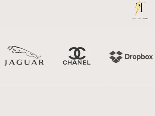
2. Pictorial Marks (or Logo Symbols)
Pictorial marks, or logo symbols, are icon or graphic-based logos that omit text and rely on a single image to represent the brand. These logos can be iconic and memorable, such as Target’s bullseye and Starbucks’ siren.
Advantages:
- Can be understood across all languages and cultures
- Simple and effective
Disadvantages:
- Brand recognition can be more challenging to establish without any text
- Logo symbols must be chosen wisely and may or may not connect to the brand’s purpose
3. Wordmarks (or Logotypes)
Wordmarks are text-based logos that use font selection, typography, and color to turn the brand name into a logo. They often work well with companies with unique, catchy names, like Google, Coca-Cola, and Disney.
Advantages:
- Simplicity
- Easy to incorporate into other design assets
Disadvantages:
- Challenging to create a unique, memorable logo with only text
- Not suited for longer or less unique company names
4. Monogram Logos (or Lettermarks)
Monogram logos, also known as lettermarks, use initials to create a streamlined logo for companies with longer names. Examples include HBO (Home Box Office) and IBM (International Business Machines).
Advantages:
- Concise and easy to remember
- Easily scalable
Disadvantages:
- May need to place the full brand name below it until recognition is achieved
- Can be confusing if initials match another brand
5. Abstract Logo Marks
Abstract logos are unique pictorial representations of a brand, like Pepsi’s abstract logo. They use geometric forms and colors to cultivate the meaning and emotion of the brand.
Advantages:
- Inherently unique and challenging to mimic
- Can communicate complex ideas with simple shapes and colors
Disadvantages:
- Open to interpretation (and misinterpretation) due to their abstract nature
- Logo meaning may be unclear, especially for unestablished brands
6. Mascot Logos
Mascot logos involve an illustrated character to create a fun, friendly personification of a brand. Examples include the Kool-Aid Man and Mr. Peanut.
Advantages:
- Inviting and approachable, cultivating a family-friendly brand image
- Allows for a high level of control over brand storytelling
Disadvantages:
- Not suitable for brands with a serious or corporate image
- Complexity from a design perspective may pose reproduction challenges at smaller sizes

7. Combination Marks
A combination mark combines text and an icon, offering versatility and clarity in brand messaging. It can be a wordmark or lettermark combined with an abstract mark, pictorial mark, or mascot.
Advantages:
- Allows for many variations of the logo, such as text-only and image-only
- The combination of image and text makes the brand message clear
Disadvantages:
- Complexity may affect scalability and design aesthetics if not thoughtfully executed
How to Design a Logo
Designing a logo that encapsulates your brand can significantly aid in your growth, but doing it correctly is equally crucial. Here’s a step-by-step guide on how to design the perfect logo:
Understand Your Brand
Begin by comprehending your brand. Before diving into tools like Canva or starting a sketch, pinpoint your brand’s story, specific values, and emotions you want to convey through your logo. Understand your target audience, buyer personas, and how you want people to feel when they see your logo.
Brainstorm Words
Use tools like Thesaurus.com to brainstorm words that describe your brand’s central theme. Choose five to ten words that best capture your brand’s ethos to guide your logo design.
Sketch Ideas
Create rough sketches based on your brainstormed words and brand story. Trust the process and let ideas flow. Remember, these are initial drafts, and you’ll refine them later.
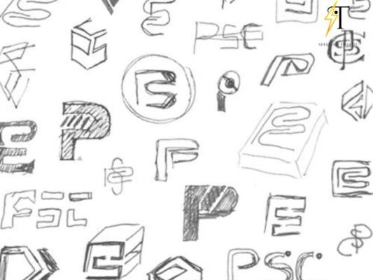
Choose and Refine a Sketch
Select the sketch that resonates with you the most and refine it. Reflect on your brainstormed words and brand story to refine your sketch into a meaningful design that aligns with your brand’s core values.
Develop Layout on a Design Platform
Transition from paper to a computer to develop your logo’s layout. Use free design platforms like Appy Pie’s Logo Maker or Logo Crisp to organize and position individual elements of your logo. Ensure proper alignment and whitespace for a visually balanced design.
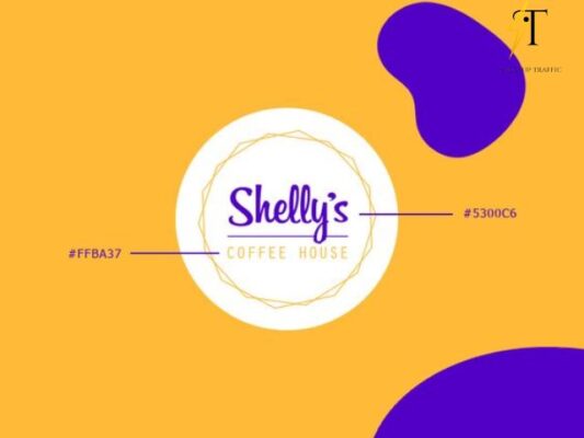
Choose Colors
Select a color palette that reflects your brand story and keywords. Consider color psychology and today’s color trends while choosing colors for your logo. Follow the three-color rule in design to maintain harmony in your color palette.
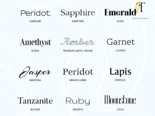
Choose a Font
Combine text with imagery by selecting an appropriate typeface for your logo. Consider how the font complements your logo and reflects your brand’s personality. Avoid generic fonts and choose a font that enhances your brand identity.
Ensure Scalability
Ensure your logo is scalable to represent your company across various platforms. Whether on a billboard or a pen, every part of your logo should be legible regardless of its size.
Get Feedback
Share your logo design with others and seek constructive feedback. Consider people’s reactions to your design and iterate accordingly. Remember, it’s better to complete the process thoroughly than to rush and end up with a subpar logo.
Conclusion
Designing a logo requires patience, creativity, and attention to detail. You can think about creating vector images so you can easily edit and design your logo. By following these steps, you can create a remarkable logo that effectively communicates your brand identity and resonates with your audience.
Related Post
Creative 21+ Fonts for Wedding Invitations Quality
Best 21+ Elegant Handwriting Fonts
Best 7 Tips to Get Improve Drawing